COLOR GRADING
Give your photos the mood you want, a cinematic look and a consistent colour palette with professional color grading.
1. COLOR CORRECTION VS. COLOR GRADING
Working with colour is divided into two clear stages. Before any styling, the base of the photo has to be right:
- Color correction: The neutral groundwork. The white balance, exposure, contrast and skin tones are corrected so that the photo looks natural.
- Color grading: An artistic and stylistic choice. Colour tones are added to the shadows, midtones and highlights to create a particular mood (e.g. cinematic, warm, cool or vintage).
2. HSL ADJUSTMENTS (HUE, SATURATION, LUMINANCE)
In the HSL panel (Hue, Saturation, Luminance) you can change individual colours without changing the whole photo:
3. COLOR WHEELS & TONING
With the colour wheels you adjust the colour tones separately in three brightness ranges:
- Shadows: Add blue or teal to the dark areas to create cinematic contrast.
- Midtones: Keep skin tones naturally warm (orange/peach).
- Highlights: Add yellow or gold to the bright areas to soften the light.
4. BEFORE AND AFTER COLOR GRADING
Color grading changes the story and mood of a photo dramatically. See how a neutral photo becomes stylised:
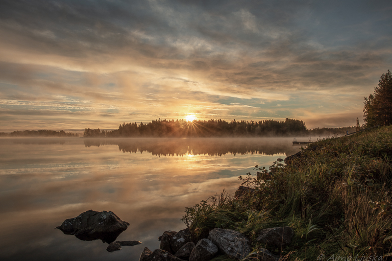
A natural photo (color correction done): colours and exposure in balance.
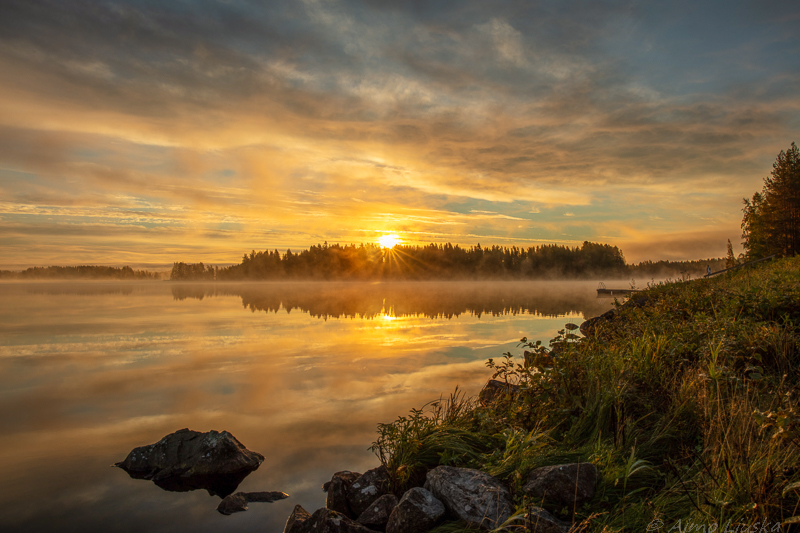
A color-graded photo: a cinematic look achieved with teal & orange toning.