Color grading & editing colours
Master Lightroom's HSL panel and the Color Grading wheels, and give your photos a mood of their own that people recognise.
The effect of colour editing: before and after
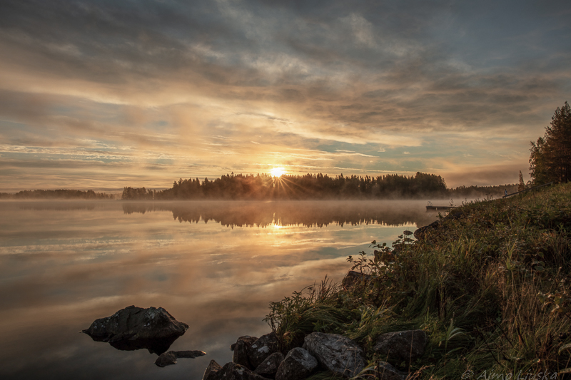
Neutral colours without any styling
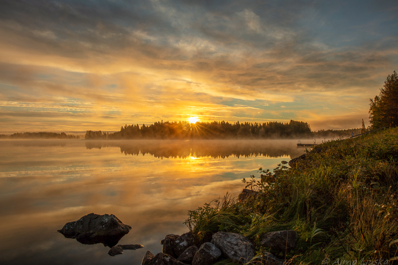
Warm highlights and cool shadows (teal & orange)
💡 Colour correction or color grading?
Colour correction makes the colours right and natural: grey is grey and skin looks like skin. Color grading comes only after that: it is an artistic choice that gives the photo a particular mood by steering colours into the shadows, midtones and highlights.
HSL / Color Mixer
Adjusts individual colours without affecting the rest of the photo:
- Hue: Changes the shade of a colour, for example making yellow greener or more orange.
- Saturation: Sets how strong or muted a colour is.
- Luminance: Adjusts how bright a colour is, for example darkening a blue sky.
Targeted adjustment: Click the small target icon in the top left corner of the panel and drag with the mouse directly on the photo. Lightroom adjusts exactly the colours under the pointer.
The Color Grading wheels
Tint the different brightness ranges of the photo with colours you choose:
- Shadows: Blue or teal is often added to the dark areas.
- Midtones: Affects skin tones and the overall look of the photo.
- Highlights: Warm orange or yellow is often added to the bright areas.
- Global: Tints the whole photo at once.
- Blending and Balance: Blending sets how softly the tones merge into each other. Balance moves the boundary between the shadows and the highlights.
How to color grade a photo
- Fix the basics: Get the white balance, exposure and contrast right.
- Tidy the colours in the HSL panel: Tone down distracting colours, such as a green or blue that is too bright.
- Choose a mood: Decide whether you want a warm, cool, contrasty or faded look.
- Tint the shadows and highlights: Drag the centre point of the colour wheel gently towards the colour you want. Keep the saturation below 20 to begin with.
- Adjust Blending and Balance: Fine-tune how the tones mix and which of them dominates.
- Check the skin tones: If there are people in the photo, make sure the skin hasn't turned greenish or too orange.
- Save it as a preset: Turn a successful grade into your own preset, so the whole series gets a consistent look.
Popular styles and starting values
The Hue values are degrees on the colour wheel. Use them as a starting point and adjust by eye.
| Style | Shadows | Highlights | Suits |
|---|---|---|---|
| Teal & orange | Teal (Hue ~200, Sat 15) | Orange (Hue ~40, Sat 15) | City, travel photos, portraits |
| Warm autumn | Brown (Hue ~35, Sat 10) | Yellow (Hue ~50, Sat 20) | Autumn colours, golden hour |
| Cold winter | Blue (Hue ~220, Sat 15) | Light blue (Hue ~210, Sat 8) | Snow and frost photos |
| Film look | Green (Hue ~160, Sat 10) | Cream (Hue ~45, Sat 12) | Everyday photos, a nostalgic mood |
| Moody | Dark blue (Hue ~225, Sat 20) | Neutral or a very light warm tone | Fog, forest, rainy weather |
A pro checklist for editing colours
\ key.
The most common mistakes
- Skin turns greenish: The teal in the shadows has spread into the midtones. Move the Balance slider towards the highlights or add a little warmth to the midtones.
- Sky turns a strange purple: The blue hue has shifted too far. Bring blue back closer to zero in the HSL panel.
- Photo looks dirty: Too much colour has been added to the shadows. Lower the shadow saturation and check that there is no colour in the blacks.
- The grade looks different in different photos: The white balance varies between the photos. Make the white balance consistent before you copy the grade.